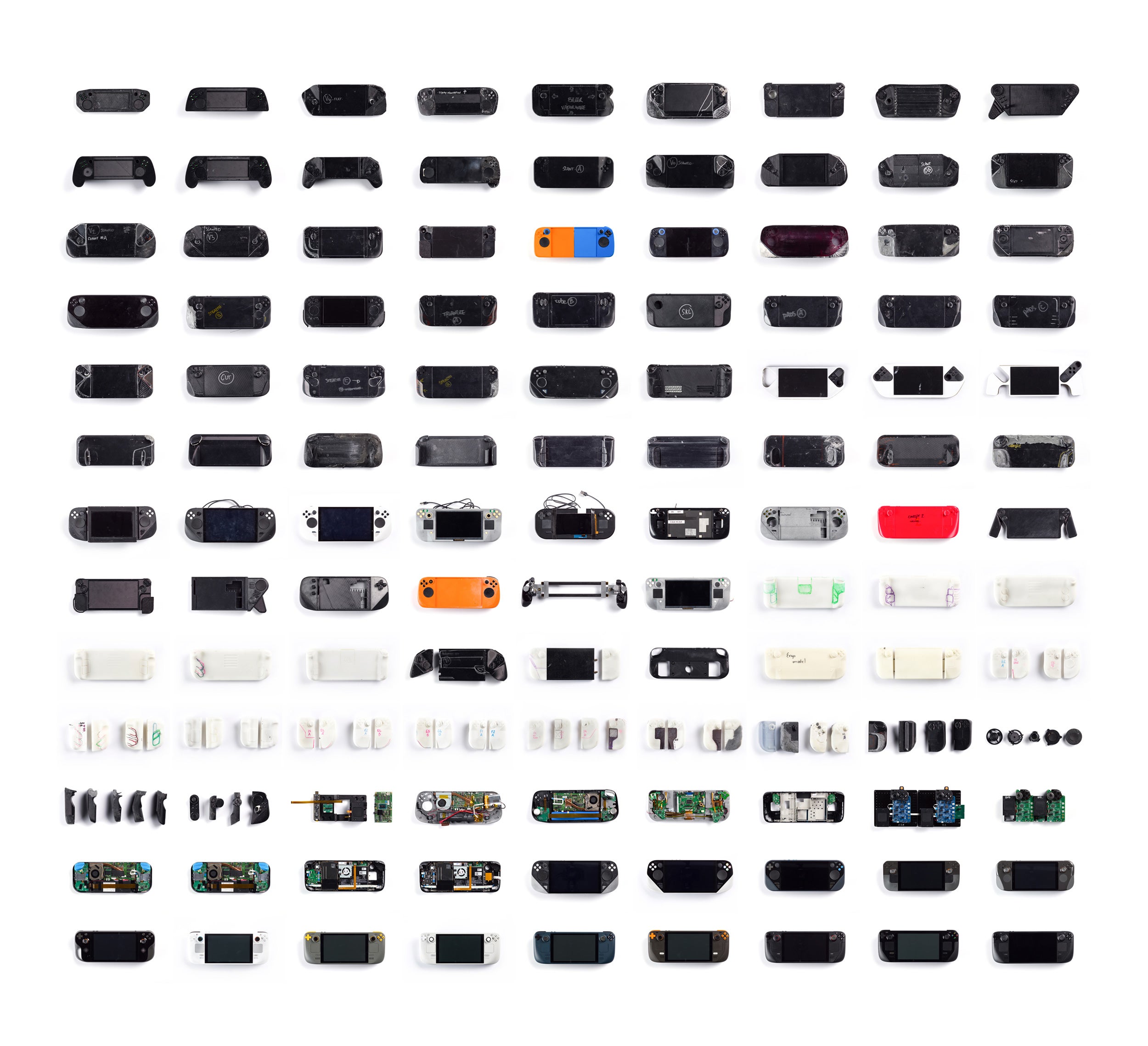
Despite prioritising function over a particularly sexy form, the final Steam Deck is a likeable little PC with comfortable controls. But the study of history will always inform the present, so in the interests of knowing a) where the Deck’s design came from and b) precisely which bullets we dodged, let’s take a look at some of the more striking prototypes that never made it off the Valve workbench.
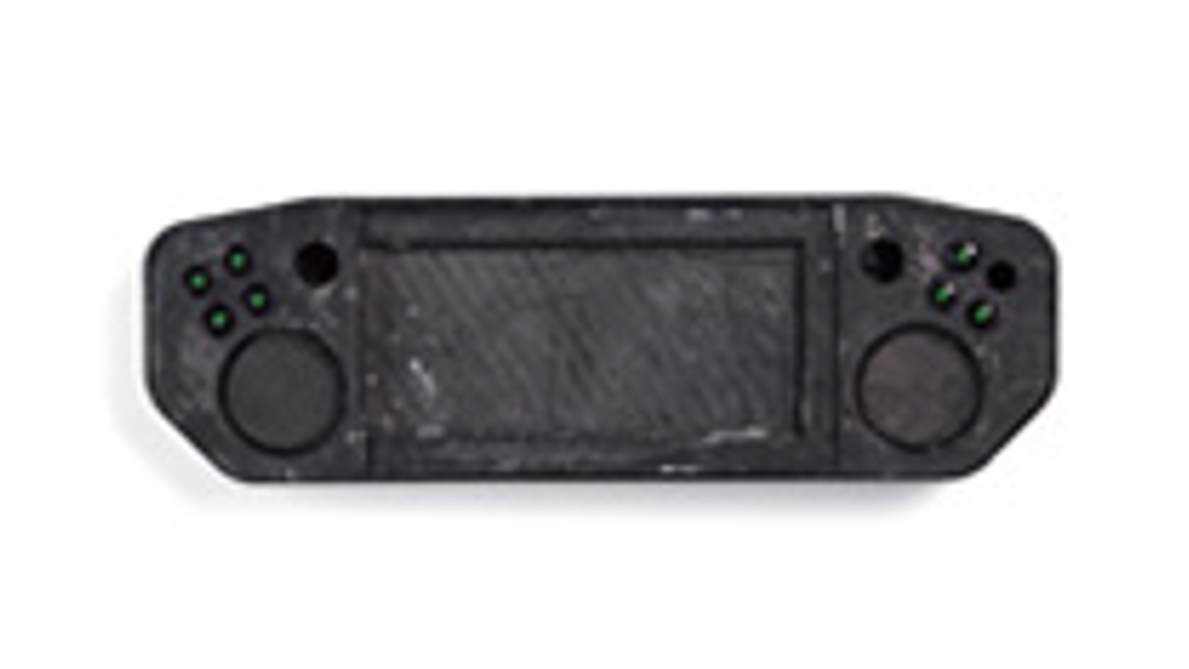
The burn victim
I can’t imagine a reality in which holding this is comfortable, partly because it looks like it’s been pulled from the smouldering aftermath of a wildly successful arson attack. Moreover, the trackpads – circular, as they were on the Steam Controller – seem like they’d spend more time in the balls of your thumbs than they would at the tips. The thumbsticks and one of the main buttons are missing, probably melted in the fire.
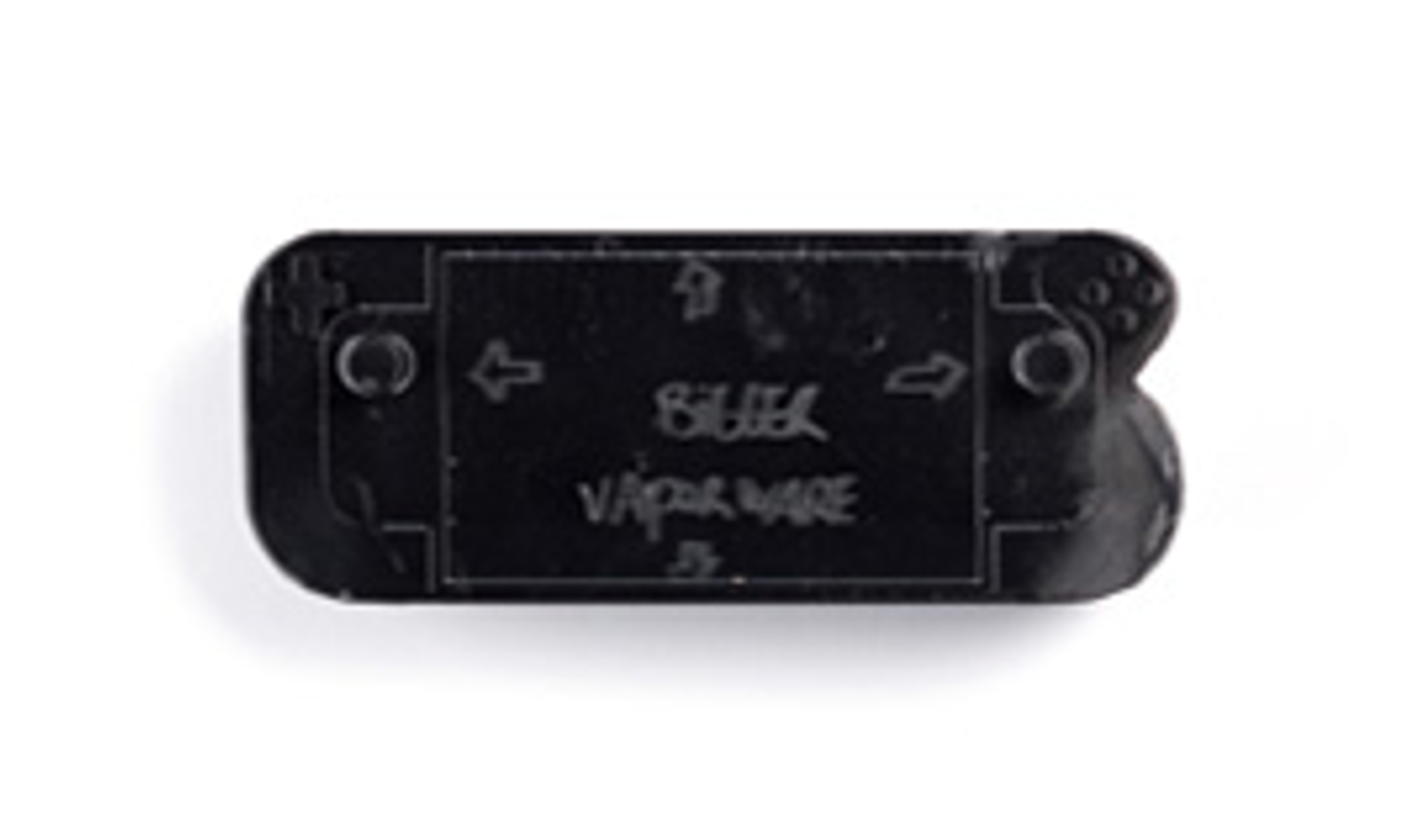
The crisis of confidence
This one looks much more like the finished Steam Deck, with a proper D-pad instead of segregated buttons and that taller 16:10 screen. Not sure what’s happening over the right-hand edge, though – did the designer’s dog bite their arm as they were drawing it? On the subject of scribbles, someone clearly thought the screen should be bigger, and also that the Steam Deck was vapourware? Aw, come on now, I know it’s Valve we’re talking about but you gotta have some faith in a release date.
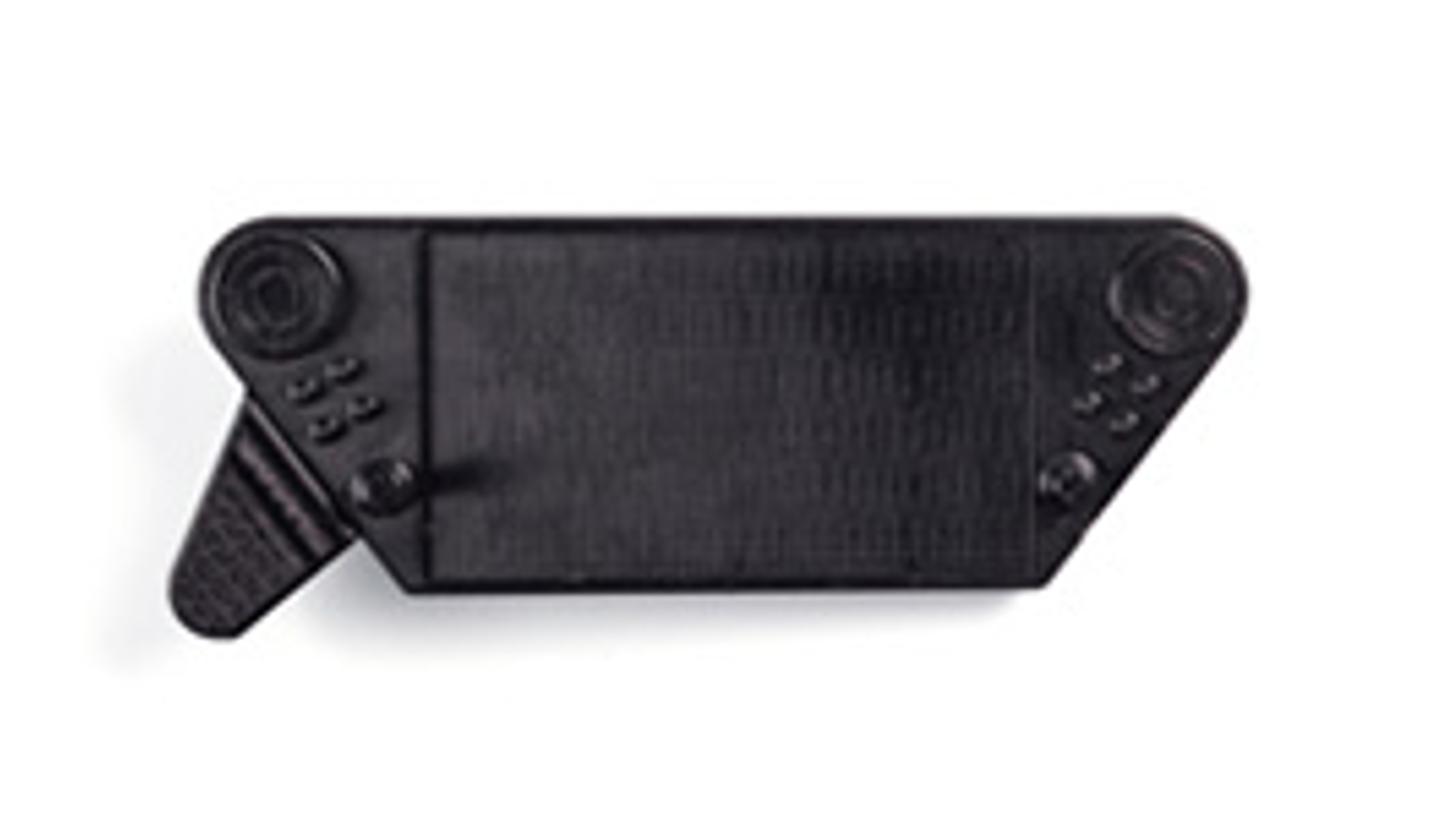
The one-armed handset
What. What is this. I want to assume that this design was merely snapped before someone could bolt on a second handle, but even the one that’s on there doesn’t exactly scream ergonomics. It just kind of sticks out, like one of Mr Krabs’ legs. And would the high-mounted, practically overhanging trackpads even be within standard thumb range? I don’t actually mind the slightly Atompunk proportions in a purely design sense, though I also find it hard to look at this without thinking “Gosh. Look at all those corners I’ll inevitably drop it on.”
The wiiiiiiide controller
It’s easy to see the thinking behind this: loads of people are comfortable with controllers, so why not just make the Steam Deck a controller with a screen in the middle? Admittedly, this does have the side effect of resembling those indescribably naff clip-on controllers for smartphones, and at this stage in the design process Valve were clearly still mistaken than four floating buttons make an adequate D-pad replacement. But I’d like to at least try this version of the Deck, I think – the contours of the handles are an obvious improvement on the harsh pointiness of that last design.
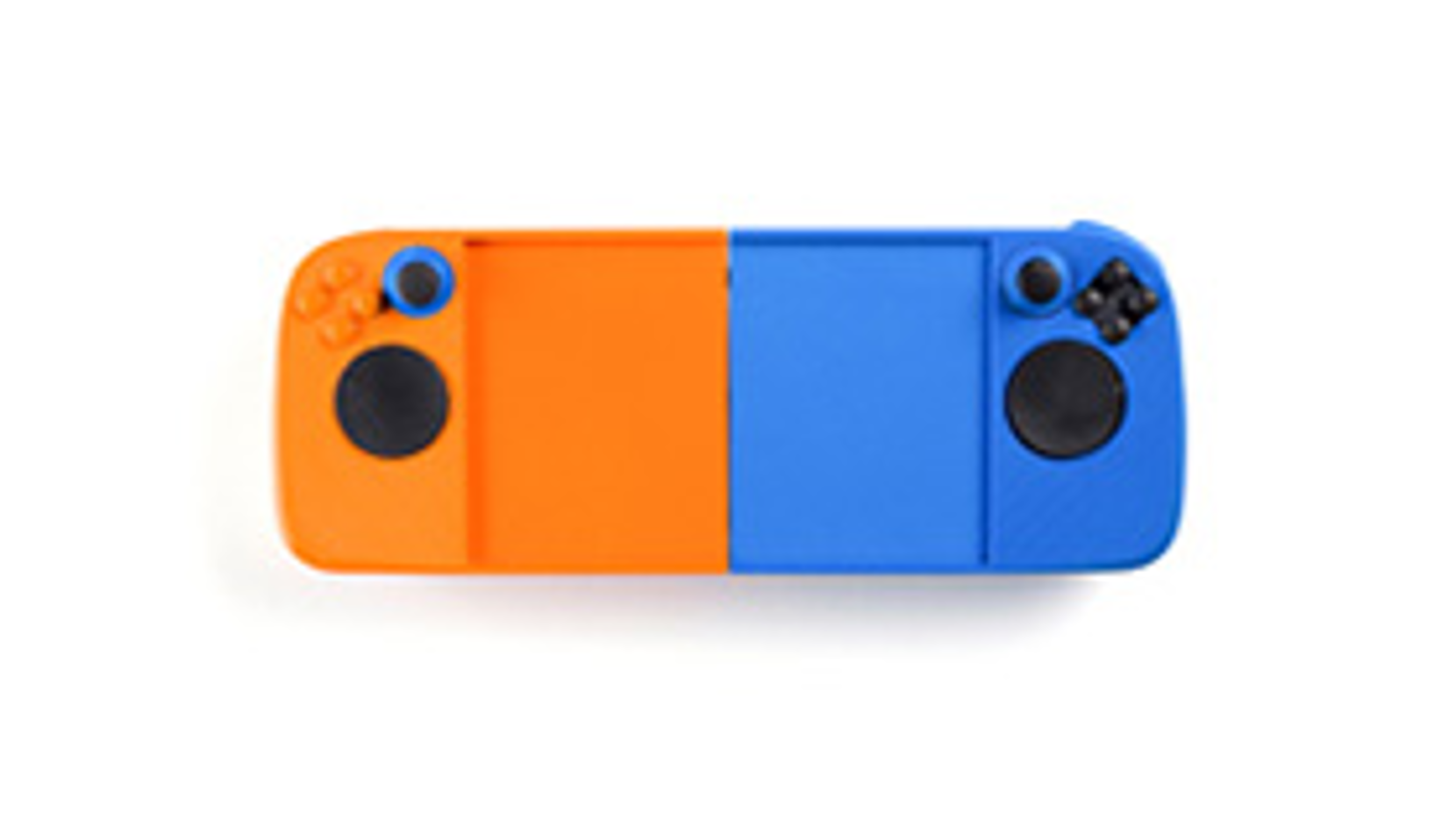
The orange and blue one, I guess
This would easily be one of the more middle-of-the-road Steam Deck prototypes, were it not for the fact that it’s brighter than the sun. Man, what a potential departure from Valve’s previous, perma-grey hardware: a return to the bold, vividly clashing colours of a childhood toybox, a mission statement of pure fun without a single care for consumerist convention. Or they needed some scrap plastic and only had blue and orange lying around, one of the two.
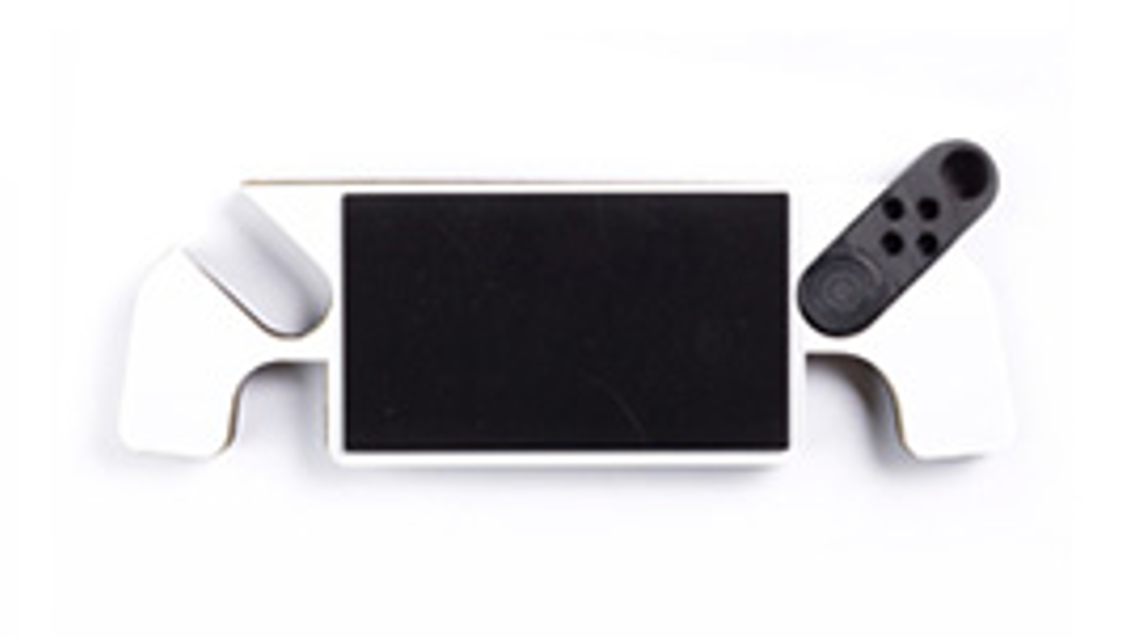
The maybe modular one
Now this is interesting: has this design simply not had its left-side controls installed yet, or are they fully intended to be removed? It does look like the controls on the right could slip out and become a JoyCon-style mini-controller, or perhaps be replaced by another control module with different inputs. Hmmmm. This design does have problems, namely its profound ugliness and the unnecessary cutouts that could have been be space for more buttons or ports. But there’s an intrigue to it that most of the other prototypes lack, so points for that.
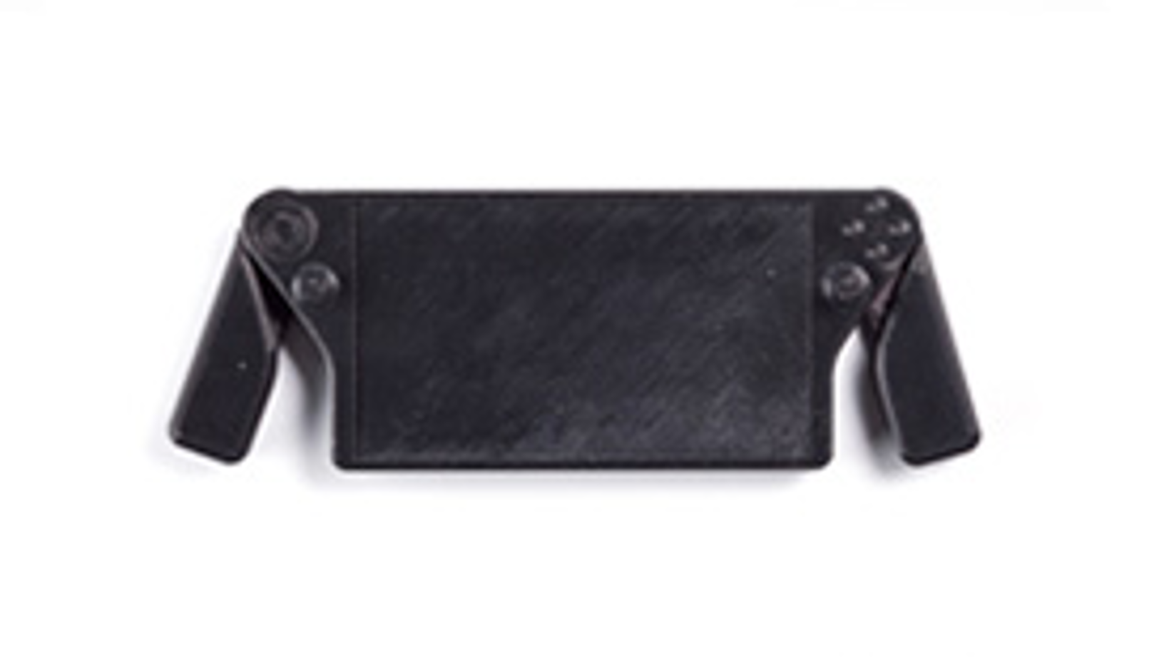
The Steam Deck Superleggera
I was going to make a bad joke about this prototype’s garden shear handles, but there’s a more pressing matter: where are the trackpads?! There’s a low-res round blur in the top-left that might be a sort of mini-pad, but neither the final square pads or the Steam Controller-esque circular sensors are anywhere to be seen. More generally, this is one of the skinniest designs in the collection by far, so someone must have been dead serious about lightening the Steam Deck’s load if it involved cutting out a Valve hardware staple.
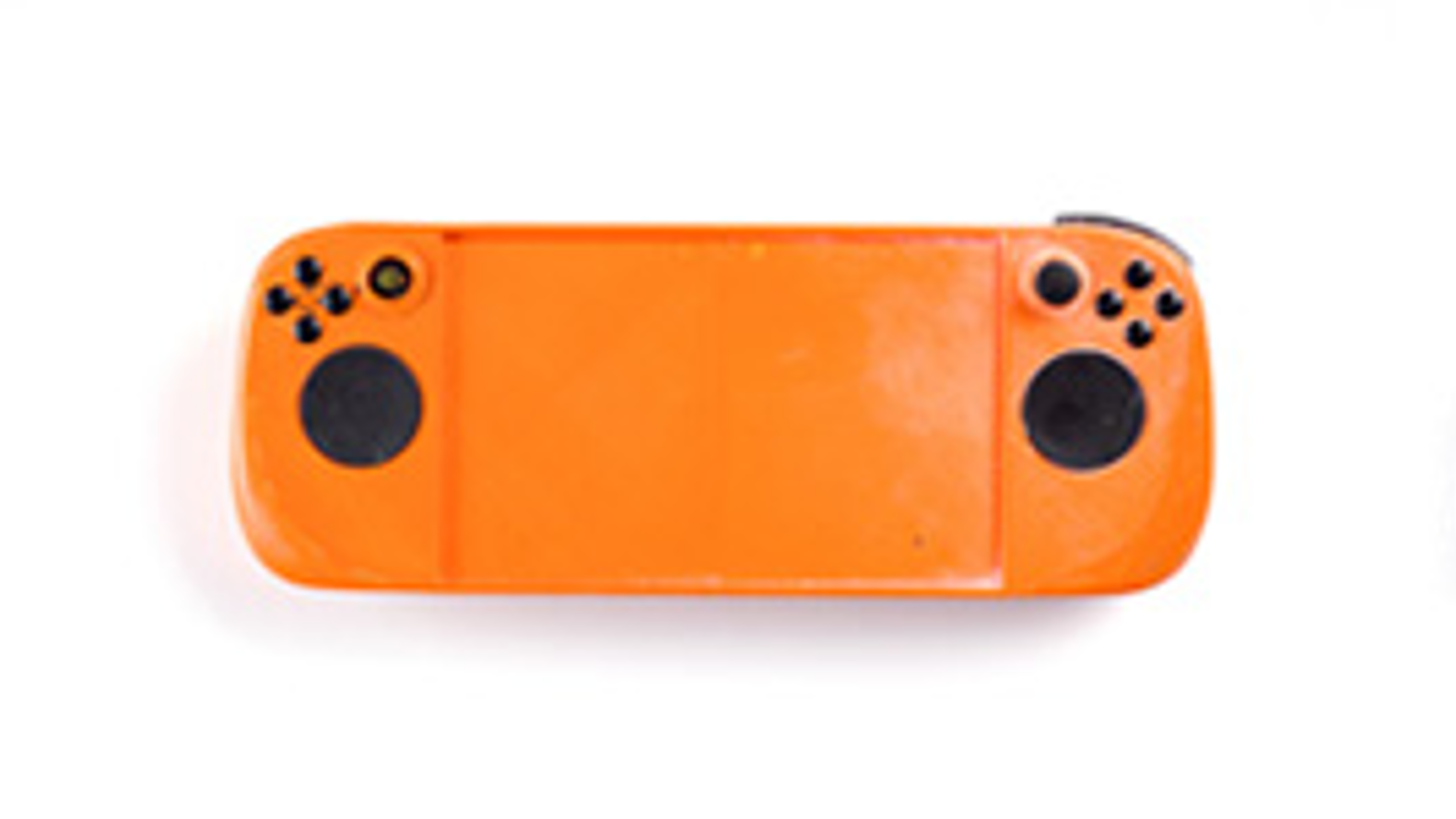
The ”No, honestly, orange can work”
The blue was evidently deemed unnecessary. Also, Graham called this design “This Funko Pop lookin’ thing” when I shared it in Slack, and he’s right – those trackpads do have the same dead shark eye quality as the vinyl figurines, which just isn’t apparent on all the black and grey models. Now, as those infinitely dark, touch-sensitive orbs bore into the sunken corners of my very being, my only comfort is that Valve ended up making them square instead.
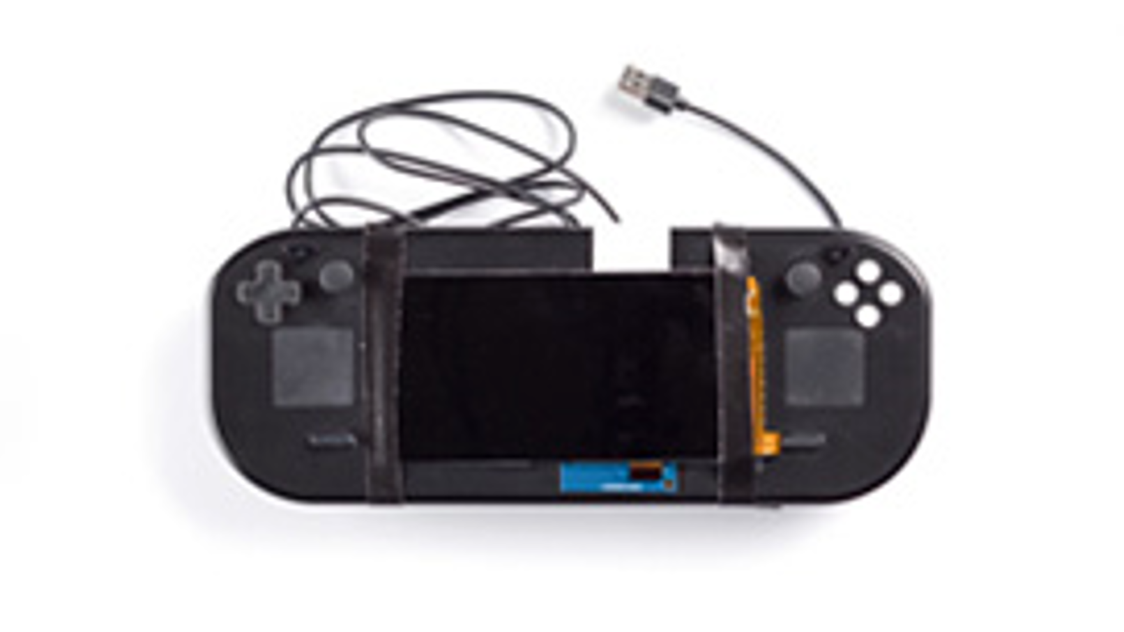
The DIY Deck
Some cursory research indicates that yes, it is acceptable for prototypes of computing hardware to have electrical tape as a structurally integral component. This design might have a whiff of “will kill you” about it, but despite looking deeply unfinished it’s also remarkably close to the Steam Deck as we know it. And I haven’t been killed by that at all yet.
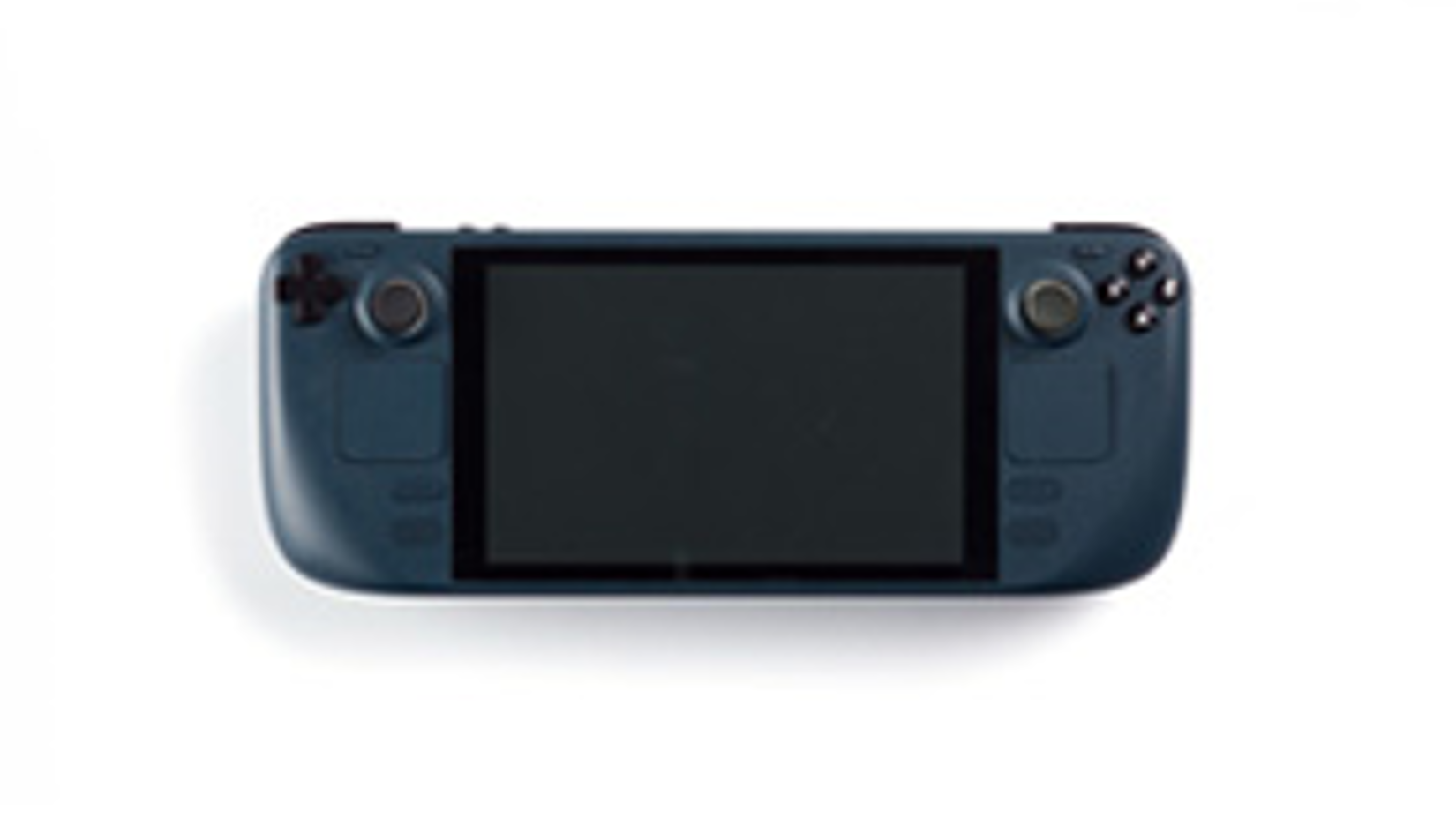
The Steam Deck, but it’s blue
…Huh. That’s quite nice. I’ve put the full collection of prototype designs below - do you have a favourite? And for more on the Steam Deck, you can read our review and our Gabe Newell interview.
